
If you plan on building a website for your business and wish to give off a ‘modern’ vibe, then it is necessary that the website integrates all the latest design trends. And for this, you first need to know which design trends are in vogue so that you can use them on the website. Below, we will look at seven top website design trends for the year 2018.
Drop Shadows
Drop shadows were a rage in the past. They were added to every single element in a website, right from photos to text and so on. But the trend soon became obsolete as people became less enchanted with the effect. However, drop shadows have seen a resurgence in past few years. And moving forward in 2018, we will see this technique being applied in more interesting ways. Thanks to parallax and other similar techniques, web designers are finding out innovative ways to use drop shadows on their websites in a way that creates a stunning effect. And if you have hired the team at Rank Envy to design your business website, be sure to ask them about integrating this effect to give your site a trendy look and feel.
Brutalism
Brutalism, as the name indicates, is a design philosophy that intentionally breaks all rules of what a ‘proper’ website must look like. Instead, the designer goes all crazy and ends up creating a website filled with all types of design elements that might look too jarring and complex at first but is sure to hold the interest of the visitor for some time. The focus of the design will be to intrigue the site visitor that they feel compelled to explore the website out of a curiosity to find out what it contains. Brutalism is a rather new trend in web design, but you will see it being embraced widely in 2018 and beyond.
Particle Backgrounds
Many website owners want to add some movement in the background of their website. And while this was earlier achieved by using videos or other complex animations, the problem of such solutions was that it used to hamper the efficient performance of the website. In fact, the website might even load too slow, thereby turning away potential visitors. However, with particle backgrounds being introduced, web designers now have a way to add interesting movements to the background without significantly affecting the website performance.
Organic Shapes
In earlier times, web design was mostly restricted to using rigid shapes, such as a perfect rectangle, square, circle, and so on. But the trend of integrating organic shapes is catching up very fast among designers. In fact, you will find websites that completely use only organic shapes on their pages, with little to no presence of fixed shapes. And this shift from strictly line-based shapes to curvy, organic shapes will become more prevalent as the year passes by.
Big Typography
Typography has always been a major design factor in websites. There are also sites that rely heavily on fonts, their shapes, sizes, and variations, in order to create an appealing effect. And one latest trend in typography is the use of big fonts. And by big, we mean big enough to fill the entire page. For example, if the name of your business is ‘Karma’, then the word ‘Karma’ will be shown on the first page, with the font filling up the screen space completely. There may be a few design elements in the background or foreground, but their presence is usually dwarfed by the large font.
Page Transitions
An aspect of website animations that site owners have happily been lapping up is page transitions. And it is understandable why this is so. After all, the most appealing method to present content will be to use page transition effects like fade-in, fly-out, and so on rather than having the entire webpage scroll through in a boring way. More websites are expected to ditch the scroll effects completely in favor of smooth page transitions. As such, it is recommended that you do include this effect in your website too so that it has a sleek, modern look to it.
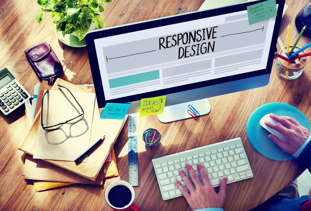
Focus On Mobile
For the past few years, mobile phones have been an important consideration when designing websites. But there is a big shift happening on this front as well. Earlier, designers used to create a website for desktops using responsive technologies with the expectation that it will adapt itself to mobile devices. However, web designers are moving on to a mobile-first approach, where the entire website is designed by keeping mobile phone users in mind. And if your website will attract mostly mobile visitors, then this is something you should definitely look into while talking to your web designer.